 +420 571 612 420
 gds@gds.cz

 EN
EN
 CZ
CZ
 hu
hu
 bg
bg
 fr
fr
 ro
ro

In our last article, we talked about how the world's swatches can make it easier for us to communicate about colour.
Today, we'll pick up on that theme and look at why the same colour can appear differently in different conditions, and how to prevent these risks. Color is not an absolute value - its final appearance is always a combination of the light source, the physical material, the human eye, and the technique on which the color is observed.
Colour perception issues: what to look out for in practice
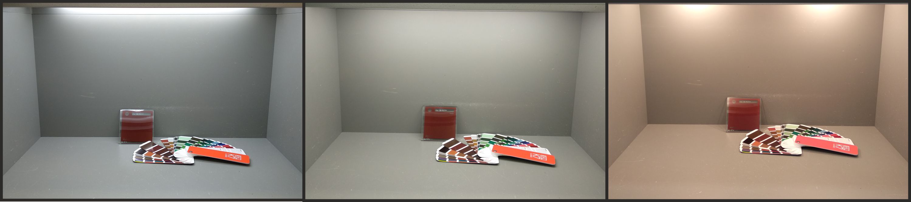
1) Metamerism - When The Colour "Changes" According To The light
The mystery of changing colour
You may have noticed that colour sometimes looks a certain way indoors and completely different outdoors in daylight. Metamerism is often the cause of this phenomenon.
Metamerism occurs when two samples look the same under one type of lighting but different under another. This happens especially with shades mixed from multiple pigments that have different spectral properties.
Metamerism in practice
This risk is often encountered, for example, in:
- Coloured glass facades: the production takes place in halls under artificial light, but the final installation is outdoors. The difference in lighting conditions can change the final visual impression.
- Approval of samples: Investors usually assess samples in meeting rooms. However, the finished product is usually placed in daylight and the final shade may appear different.
How to prevent metamerism
- Always insist that all paint supplies are made with the same recipe, as it is the different production recipes that affect metamerism.
- When developing, we work with D65 (daylight) as standard . If the product is to be used in a different environment, a specification is required beforehand.
- Always approve samples in conditions that correspond to the final use.
2) The Human Eye, Everyone Sees Colours a Little Differently
Individual differences
Colour perception is not the same for all people, some people distinguish colour shades very accurately, others less accurately. In addition, a part of the population has a colour-sensitivity disorder. In general, however, it is known that women have a statistically finer ability to distinguish shades.
Tests and training
- Colourvocity can be easily tested, e.g. with the Farnsworth-Munsell 100 Hue test, which ranks colour cards from lightest to darkest.
- Practice and experience greatly improves the ability to see subtle rides.
Sensitive and tolerant hues
- For some shades (e.g. green, yellow, neutral grey) the human eye is very sensitive to any difference. Other shades, on the other hand, are "tolerant" and we hardly notice small changes.
3) Surface Texture - When The Same Colour Does Not Look The Same
Even in a situation where two colors have identical lab values (L*a*b*) and ΔE = 0, the human eye can perceive a difference. This is due to the surface texture, which affects how light is reflected from the material.
How the surface changes the perception of colour
- Glossy surface - colours on a glossy surface appear richer, deeper and higher contrast.
- Matte surface - light is scattered, the colour may appear lighter or flatter.
- Coarser texture - shadows on a textured surface can visually darken the color or create an "unsettled" impression.
In practice, this means that the same shade will not look identical in matte and gloss, or on a matte vs. textured surface.
How to prevent this
- It is ideal to approve paint samples on the same finish as they will be used on the final product.
- If the technology does not allow all variations to be produced equally, the differences should be pointed out in advance and physical samples submitted.
4) Intermediate Electronics - The Colour On The Monitor Is Not The Colour In Reality
Most people work with conventional monitors, phones or laptops that are not calibrated. In practice, this means that the colours on the screen should be taken as indicative only.
It is important to know that:
- Every monitor displays colours slightly differently.
- Photos can be distorted by white balance, compression or light during shooting.
- The display never serves as a binding basis for shade approval.
Recommendations for practice
When making any color decision, it is essential to work with:
- physical sample,
- the official swatch book,
- and the matching light source.
Conclusion
Colour perception is a complex process. It is influenced by light pigments, the surface, the human eye and the device on which the colour is viewed. Understanding these factors is the key to ensuring that the shade meets expectations - and that there are no misunderstandings or unnecessary complaints.
If you're working on a project where accurate shade determination is key, we'll be happy to help you get everything right - from recipe selection to specific light measurement.
Article written by:
David Batla
Owner of GDS Technology Ltd.

Write to us

 Settings